Landing Page Examples: Fashion
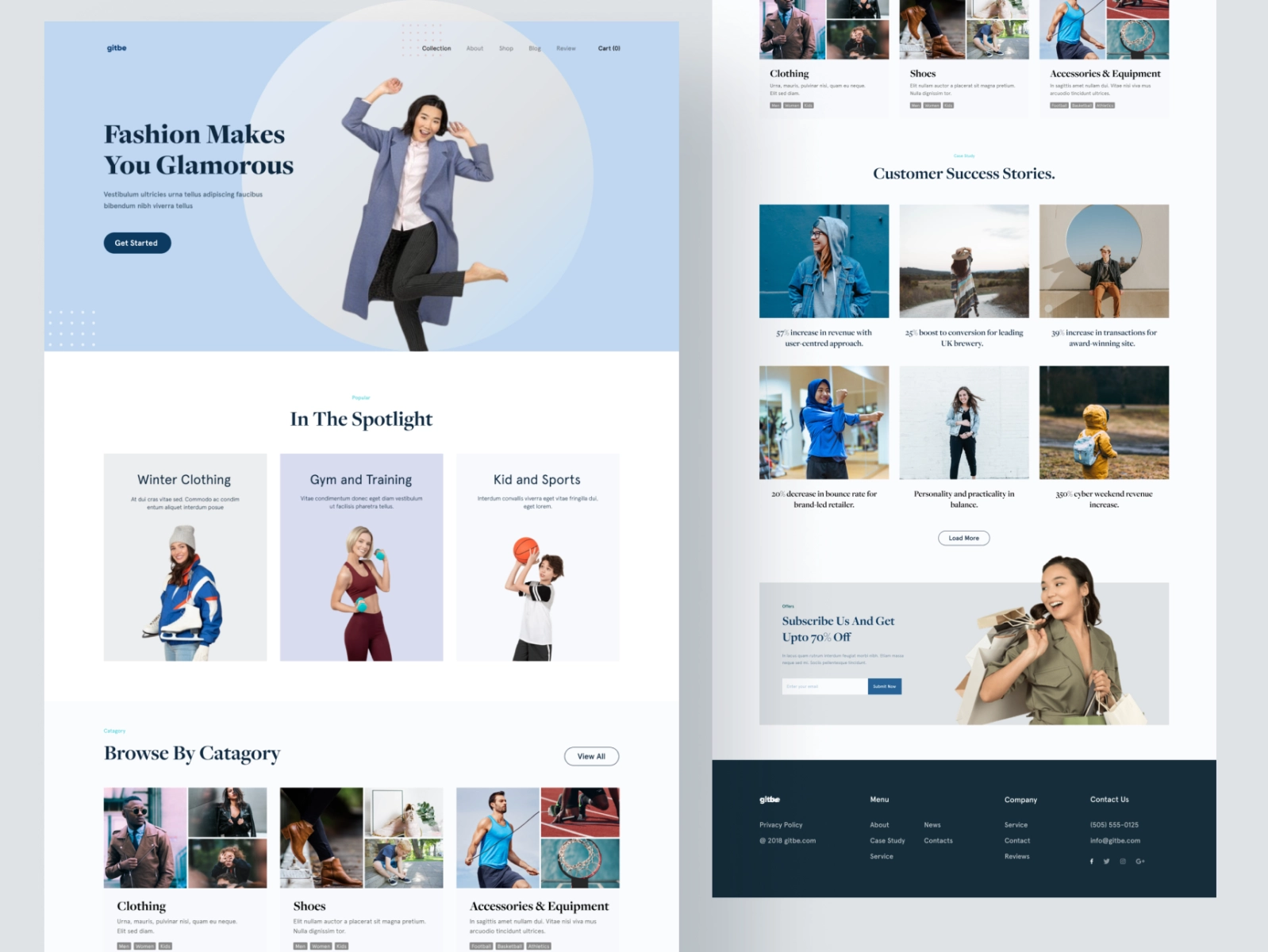
The example above is a fashion landing page that provides sportswear, casual, to semi-formal clothes. The background of this landing page is white so that product photos can stand out.
To maximize your fashion landing page, you need to reflect on your overall business branding. If the fashion you offer is street fashion, then use a website theme to copywriting that is in accordance with the characteristics of street fashion. It’s different if the fashion you offer is timeless fashion. You may want to use a more classic and softer landing page theme and language.
Landing Page Examples: Online Shop
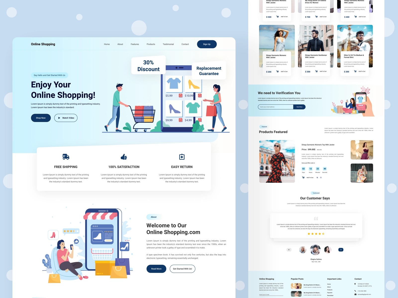
The example above is an online store landing page. Incidentally, the theme used is soft and bright colors, baby blue and white. even the background is polka dot. You can see that there are various menus and CTAs that are usually found in online shops.
To maximize your online shop website, you need to arrange menus and CTAs in such a way as to direct visitors to purchases. Menu layouts and CTAs that make purchases easier also make visitors like your page, because they don’t get confused when they want to buy something.
Product photos are also very important in an online shop. Make sure the product photos displayed are proportional and in accordance with the goods being sold.
Landing Page Examples: Cosmetic
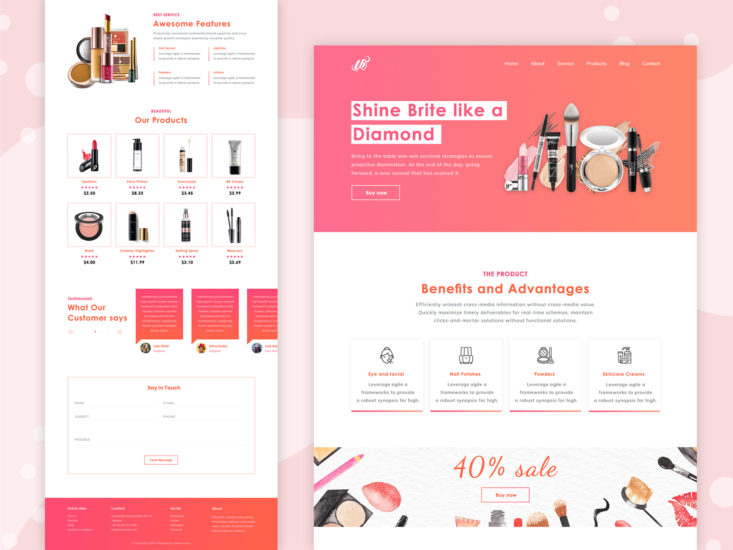
The cosmetic landing page above takes the pink color theme that is closely related to women. You can see the strategic layout of the page, the main product being promoted is displayed at the top, the excess cosmetics are put under it, there is a very clear discount description, then the cosmetic choices are easy to digest, and the testimonials below are accompanied by a form to collect leads.
Read: How to Turn Leads into Sales
To maximize a cosmetic landing page, the first thing you need to pay attention to is the UI/UX that fits your target market and business branding. Make sure your product photos are very clear and attractive, as well as the description. You can adjust other important components according to your needs, for example a discount statement like the example above.
