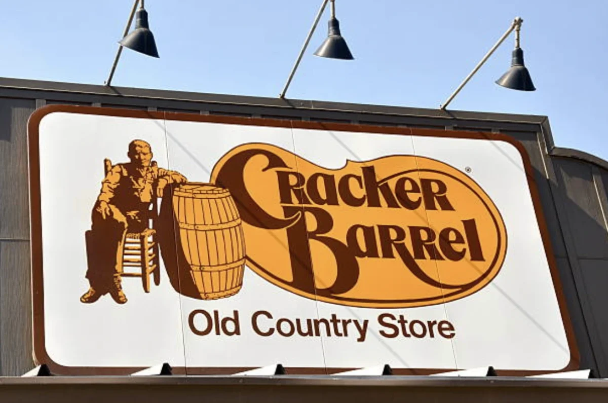
Cracker Barrel spent more than a year and hundreds of millions of dollars on a genuine operational turnaround — and almost none of it is what people remember. What they remember is a logo. When the chain retired its familiar “Old Timer” mascot in a simplified rebrand last August, the backlash was immediate, political commentary amplified it within days, and the company reversed course before the new design had even finished rolling out. Nearly a year later, when CEO Julie Masino announced her departure, the logo controversy had become the default explanation — even though the actual financial story behind her tenure was far more complicated than a single design decision.
This is the branding trap: a visual change so visible that it eclipses everything substantive happening underneath it. Cracker Barrel’s rebrand fiasco offers one of the clearest recent examples of how a logo can end up carrying more weight in the public narrative than years of real operational work — and what that reveals about how customers actually experience a brand.
What Actually Happened
Cracker Barrel’s logo controversy didn’t emerge in isolation — it landed in the middle of an already difficult turnaround. In May 2024, months before any redesign was unveiled, the company announced a three-year plan to fix a weakening business: overhauling restaurant operations, refreshing menus, expanding digital ordering, and committing $600 million to $700 million in capital spending to remodel locations. The plan came with a blunt admission that guest traffic was falling short of expectations. That fiscal year, comparable restaurant sales slipped 0.1% and net income fell nearly 59%, from $99.1 million down to $40.9 million.
Against that backdrop, Masino was already under pressure from activist investor Biglari Holdings, which had spent years arguing that leadership wasn’t turning the business around fast enough. Then came the logo. The redesign simplified decades of increasingly detailed illustration into a flatter, more minimal mark, and it arrived alongside brighter, less cluttered restaurant interiors being tested in a handful of locations. Customers noticed immediately — and the backlash escalated fast enough that, within days, Cracker Barrel restored the previous logo and paused the broader remodel rollout after testing it in just four restaurants.
What makes the story more complicated is what happened next. Fiscal 2025 delivered the strongest evidence yet that the underlying turnaround was actually working: comparable sales rose 5.4% in the fourth quarter, and the company posted its first annual increase in adjusted EBITDA since the plan began. Then fiscal 2026 undid much of that progress, opening with a net loss of $24.6 million before results began stabilizing in the third quarter. Masino’s exit was announced July 27, in the middle of that uneven picture — with no single financial result that cleanly explains the decision, and no official statement ever tying her departure to the logo itself.
Why the Logo Became the Story, Not the Turnaround
The uncomfortable truth for Cracker Barrel’s leadership is that operational improvements are largely invisible to customers, while a logo is not. Menu refreshes, back-of-house technology investments, and staffing changes don’t register the moment someone glances at a restaurant — a new sign out front does. Every other part of the three-year plan required a customer to actually notice a change in food quality or service; the rebrand required nothing more than driving past the building.
Brand strategist Olaf van Gerwen, founder of Chuck Studios, frames this as a fundamental mismatch between how companies think about their own brand and how customers actually experience it: people don’t encounter brands through strategy documents, he argues — they notice something familiar has quietly disappeared before they can even articulate why it bothers them. Cracker Barrel’s roadside signage, front-porch rocking chairs, and antique-covered walls had spent decades building that kind of instant, pre-verbal recognition. The Old Timer mascot did the same job. Removing it didn’t just update a logo — it pulled out one of the visual anchors customers used to recognize the brand before they’d even walked through the door.
Branding consultant Allen Adamson takes this argument a step further, suggesting Cracker Barrel correctly diagnosed that its brand needed modernizing but badly miscalculated how much visual identity it could remove before the chain stopped looking like itself — comparing what remained to something that could belong to any generic strip-mall chain. That’s a familiar failure mode in retail branding more broadly: KFC’s own 2026 rebrand shows a chain attempting the same balancing act — refreshing a decades-old identity without erasing the visual cues that make it instantly recognizable at a glance.
The Psychology of Familiar Brand Cues
What happened at Cracker Barrel is really a case study in how deeply customers rely on visual consistency to navigate their relationship with a brand, often without consciously registering it. This isn’t unique to restaurant chains — it shows up anywhere a company builds recognition around a specific, stable visual identity over time, from how a musician’s rebrand can function as a deliberate blueprint for signaling reinvention to how consumer brands manage the same tension between refreshing an image and keeping the cues loyal customers depend on.
The stakes are especially high for brands built on nostalgia specifically. When a company’s entire value proposition rests on feeling familiar, timeless, or unchanged, removing a visual anchor doesn’t read as modernization — it reads as loss. That dynamic has played out elsewhere in the restaurant industry too: the way customers respond emotionally to a beloved chain’s physical locations disappearing entirely mirrors the same underlying attachment Cracker Barrel underestimated — proof that customers form real emotional bonds with a brand’s physical and visual presence, not just the product itself.
Why Reversing the Logo Made It Worse
Perhaps the most counterintuitive part of this story is that backing down didn’t fix the problem — it may have deepened it. Denise Lee Yohn, author of What Great Brands Do, argues the real mistake wasn’t updating the logo in the first place; it was letting a visual change become the first and most visible thing customers experienced from the entire turnaround, without preparing for the predictable backlash that comes from underestimating how attached people are to familiar brand symbols.
Once Cracker Barrel reversed the design, it effectively validated its critics’ framing that the change had been a mistake worth fighting — while giving up nothing in return. Adamson’s read on this is blunt: the rebrand itself didn’t break the underlying business, since sales were genuinely recovering and the stock had climbed back. What it broke was Masino’s ability to lead from that point forward, because reversing a decision publicly is far easier than reversing the association customers now had with her tenure. That’s a distinct risk from the redesign itself — a self-inflicted one that came from how the company chose to manage the fallout, not from the design change alone. It’s the kind of miscalculation any marketing team weighing a high-visibility rollout against a well-structured communications framework is meant to catch before launch, not after the backlash has already gone national.
Lessons for Brands Doing a Redesign
Cracker Barrel’s experience isn’t an argument against rebranding — plenty of legacy brands successfully modernize their visual identity without triggering this kind of reaction. The lesson is narrower and more specific: a redesign needs to be tested against how much of a brand’s recognizable identity it removes, not just whether the new design looks more contemporary in isolation.
That distinction shows up in how other marketing controversies have unfolded, too. Even when a company’s underlying intent is defensible, the practical effect of a visible change on a brand’s most loyal, most attached customers can generate backlash that has little to do with what the company actually meant — a pattern that echoes other recent marketing controversies where public perception diverged sharply from a brand’s stated intent. The companies that navigate visual updates successfully tend to be the ones that treat familiar symbols as brand equity to be preserved deliberately, not incidental design elements to be modernized on a schedule. It’s the same discipline that separates brands able to absorb a real operational or financial crisis without losing their core identity from those that end up defined by a single visible misstep instead of the substance behind it.
Final Takeaway
Cracker Barrel’s turnaround was real. The financial numbers, uneven as they’ve been, tell a story of a company that identified genuine problems and started fixing them well before any logo controversy existed. But none of that mattered as much, in the public narrative, as a mascot disappearing from a sign. That’s the branding trap: the parts of a business that are hardest to fix are often the least visible, while the parts customers actually notice — signage, packaging, mascots, color palettes — carry a disproportionate share of a brand’s emotional weight. Whether or not the logo ultimately cost Julie Masino her job is something only Cracker Barrel’s board can say with certainty. What’s clear is that the company reversed its design in days, but it couldn’t reverse what that reversal came to represent.
Frequently Asked Questions
Why did Cracker Barrel’s logo redesign cause backlash?
Cracker Barrel’s 2026 logo redesign removed the longtime “Old Timer” mascot and simplified decades of detailed branding into a flatter design. Customers saw it as erasing a familiar visual identity tied to the brand’s nostalgic, country-store image, and the backlash escalated after political commentary amplified the criticism.
Did the Cracker Barrel logo cause CEO Julie Masino’s departure?
Cracker Barrel has never officially linked Masino’s July 2026 departure to the logo controversy. The company’s financial results were mixed in the year following the rebrand, with no single result that clearly explains the leadership change, though the redesign shaped public discussion of her tenure.
Was Cracker Barrel’s business actually struggling before the rebrand?
Yes. Cracker Barrel launched a three-year, $600–700 million turnaround plan in May 2024, months before the logo appeared, after comparable sales slipped and net income fell nearly 59% in fiscal 2024. The rebrand was one piece of a much larger operational overhaul already underway.
Did reversing the Cracker Barrel logo fix the controversy?
Not entirely. Brand experts argue that reversing the logo within days validated critics’ framing that the change was a mistake, without restoring the credibility lost in the process. Some analysts believe the reversal created a lasting association that followed CEO Julie Masino for the rest of her tenure.
What can other brands learn from Cracker Barrel’s rebrand mistake?
The key lesson is that redesigns should be tested against how much recognizable brand equity they remove, not just how modern the new design looks. Familiar visual cues — mascots, color palettes, signage — often carry more emotional weight with customers than companies anticipate.
Is rebranding always risky for legacy companies?
Not inherently. Many legacy brands successfully modernize without major backlash. The risk increases specifically when a brand’s core value proposition relies on nostalgia or tradition, since removing familiar symbols in that context can read as abandoning the brand’s identity rather than updating it.